Project Goal
This was a rebrand for a local Rochester company, Heodonist Artisanal Chocolates. Their current branding seemed dated and didn't feel aligned with the company. I read about the company on their webpage and tried to make a solution that fit within their beliefs.
The Logo itself
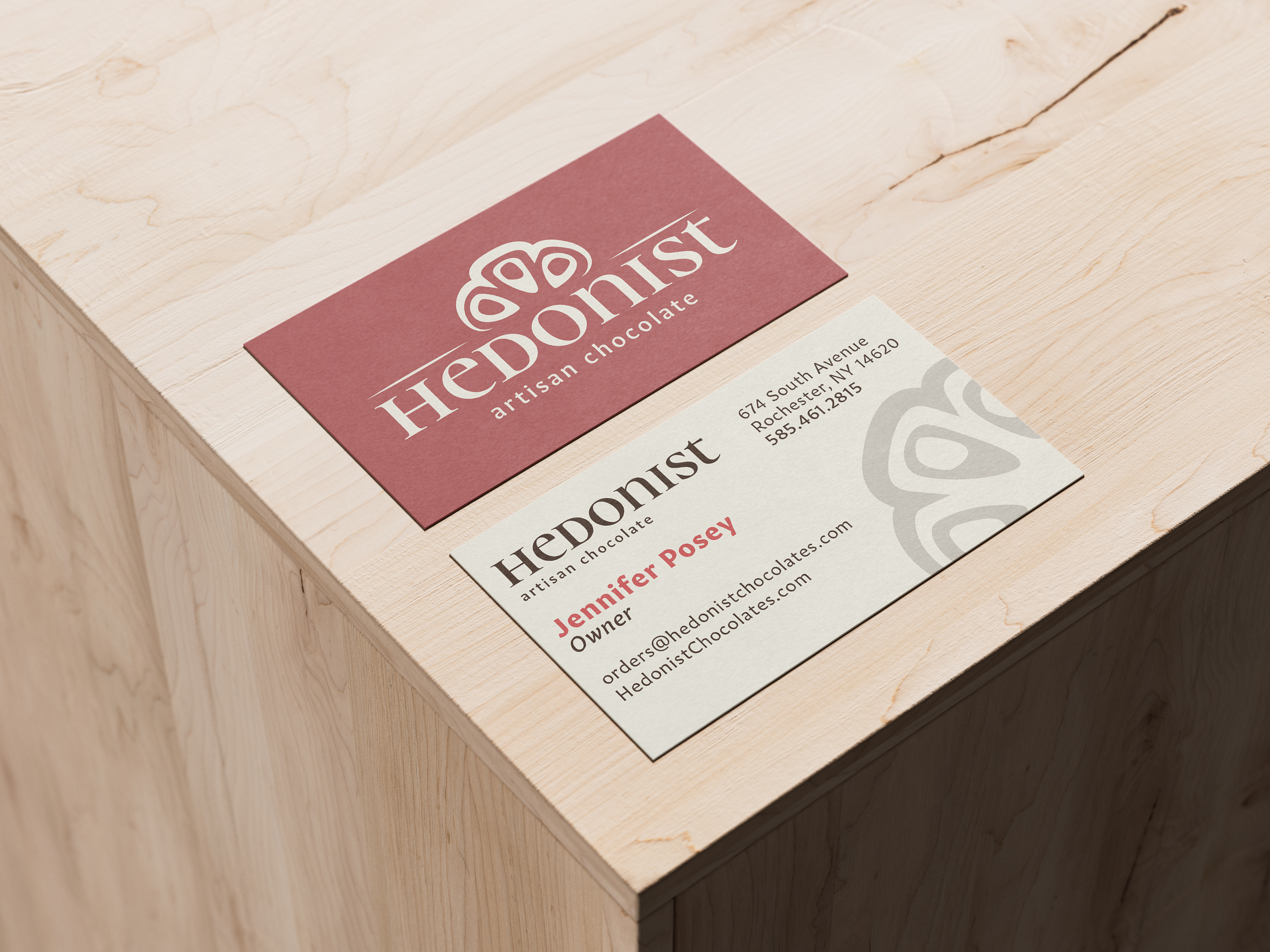
The logo is the cross-section of a cacao pod. Paired with a small cap type face, I tried to make the company seem artisanal, luxury and something worth spending money on versus super market chocolate. This is a company that prides itself on its high quality ingredients and providing a chocolate experience you can't find on supermarket shelves.
Outcome
For a first time branding project, I am happy with this outcome. This project focused on a business card, a latter head as well as a takeaway of a menu. Keeping a brand in mind while designing was very hard at first because it was beyond my personal tastes, I had to think about what would best represent a company. There are many things I would do differently design wise looking back, however this was a great experience expanding my knowledge of branding as well sharpening my type hierarchy skills.